
 码云
码云 3种方案实现跨行或跨列布局
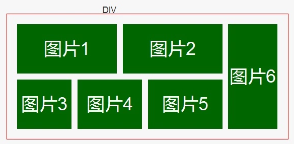
今天要讲解的这个问题是之前一位小伙伴在群里请教的提问,是关于跨行跨列的布局,如下图是他要实现的具体布局,看似是最简单的二维布局,实际透露出整个 CSS 的发展方向。向前可以考察对兼容性的处理功底,向后可以考察对 CSS 新特性的洞察能力。可攻可受,攻守兼备。
如果对此问题感兴趣的小伙伴先不要往下看我写的方案,自己想想在实际项目中遇到你会怎么做呢?
需要注意的是:这是一个两端对齐的布局,需要仔细考虑中间空隙的处理。
这里我给出三种方案实现,分别使用 css 中属性 float 实现、flex 实现、grid 实现
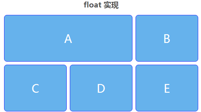
一、兼容方案 float
我想大家最容易想到的就是运用 float 的浮动特性,为了更好的处理间距,我们需要三层结构,利用 margin 负值来抵消间距,形成视觉上的两段对齐效果。
HTML 部分:
<h2>float 实现</h2>
<section class="demo">
  <div class="float">
    <section class="a">a</section>
    <section class="b">b</section>
    <section class="c">c</section>
    <section class="d">d</section>
    <section class="e">e</section>
  </div>
</section>
CSS 部分:
* {
  -webkit-box-sizing: border-box;
  -moz-box-sizing: border-box;
  box-sizing: border-box;
}
h1,
h2 {
  text-align: center;
  color: #555;
}
.demo {
  width: 620px;
  height: 310px;
  text-align: center;
  margin-left: auto;
  margin-right: auto;
  margin-bottom: 20px;
}
.demo section {
  margin-bottom: 10px;
  margin-right: 10px;
  border-radius: 9px;
  border: 1px solid blue;
  background-color: #66B2EC;
  color: #fff;
  font-size: 36px;
  text-transform: uppercase;
  line-height: 150px;
}
.float {
  overflow: hidden;
  margin-right: -10px;
}
.float section {
  width: 200px;
  height: 150px;
  float: left;
}
.float .a {
  height: 310px;
}
.float:hover .a {
  width: 410px;
  height: 150px;
}
效果展示:
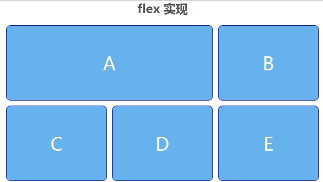
二、渐进增强 flex
flex 的处理需要一个小技巧,需要把主轴方向旋转 90 度,也就是 flex-direction: column。
- 优点:
flex 可以较好的处理两端对齐布局,中间的空隙可以通过 align-content: space-between,justify-content: space-between 来实现自适应(但超过两行或两列时会有问题)。
- 缺点:
需要通过 order 属性手动调节为正确的元素顺序。
HTML 代码:
<h2>flex 实现</h2>
<section class="flex demo">
  <section class="a">a</section>
  <section class="b">b</section>
  <section class="c">c</section>
  <section class="d">d</section>
  <section class="e">e</section>
</section>
CSS 代码:
.flex {
  display: flex;
  flex-direction: column;
  flex-wrap: wrap;
  align-content: space-between;
  justify-content: space-between;
}
.flex section {
  width: 200px;
  height: 150px;
  margin: 0;
}
.flex .a {
  height: 100%;
}
.flex .c {
  order: 4;
}
.flex .d {
  order: 3;
}
.flex .e {
  order: 5;
}
.flex:hover {
  flex-direction: row;
}

.flex:hover section {
  order: 0;
}

.flex:hover .a {
  height: 150px;
  width: 410px;
}
效果展示:
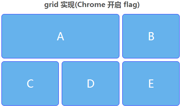
三、面向未来 grid
如果说从 Flex 开始 CSS 有了真正的二维布局特性,那么 CSS Grid 将是二维布局的未来。
- 优点:
(1)可以把传统的网页栅格体系直接对应到 CSS 声明,例如:
.grid {
    display: grid;
    grid-template-columns: 1fr 1fr 1fr;
    grid-template-rows: 1fr 1fr;
}
这样三句代码就表明我定义了一个两行三列的栅格,也就是题中的布局。
(1)通过 grid-column/row 属性里的 span 值可以方便的实现跨行或夸列,无需显性指定宽高的改变,非常方便的实现了跨行或夸列。
.grid .a {
    grid-row: span 2;
}
.grid .a:hover {
    grid-row: auto;
    grid-column: span 2;
}
最终实现代码
HTML 代码:
<h2>grid 实现(Chrome 开启 flag)</h2>
<section class="grid demo">
  <section class="a">a</section>
  <section class="b">b</section>
  <section class="c">c</section>
  <section class="d">d</section>
  <section class="e">e</section>
</section>
CSS 代码:
.grid {
  display: -ms-grid;
  display: -webkit-grid;
  display: grid;
  -ms-grid-template-columns: 1fr 1fr 1fr;
  -webkit-grid-template-columns: 1fr 1fr 1fr;
  grid-template-columns: 1fr 1fr 1fr;
  -ms-grid-template-rows: 1fr 1fr;
  -webkit-grid-template-rows: 1fr 1fr;
  grid-template-rows: 1fr 1fr;
}
.grid .a {
  -ms-grid-row: span 2;
  -webkit-grid-row: span 2;
  grid-row: span 2;
}
.grid .a:hover {
  -ms-grid-row: auto;
  -webkit-grid-row: auto;
  grid-row: auto;
  -ms-grid-column: span 2;
  -webkit-grid-column: span 2;
  grid-column: span 2;
}
效果展示:
这里网友推荐利用 display:inline-block 属性布局的方法
HTML 代码:
<body>
    <div class="row">
        <div class="item col-1 row-2">A</div>
        <div class="item col-1 row-1">B</div>
        <div class="item col-1 row-2">C</div>
    </div>
    <div class="row" >
      <div class="item col-5 row-1">D</div>
      <div class="item col-5 row-1">E</div>
      <div class="item col-5 row-1">F</div>
    </div>
</body>
CSS 代码:
*{margin:0;padding:0;}
.row {
  height: 150px;
  font-size: 0;
}
.item {
  box-sizing: border-box;
  vertical-align: top;
  height: 100%;
  overflow-y: visible;
  overflow-x: hidden;
  background-color: maroon;
  box-shadow: 4px 4px 0 #fff, -4px -4px 0 #fff,4px -4px 0 #fff, -4px 4px 0 #fff;
  display: inline-block;
  font-size: 20px;
  color: #FFF;
  text-align: center;
  padding: 8px;
}
.col-1 {
  width: 33.3333%;
}
.col-2 {
  width: 66.66666%;
}
.col-5{
    width:22.1333333%;
}
.row-1 {
  height: 100%;
}
.row-2 {
  height: 200%;
}
这里我们不讨论 table 布局,如果大家有更好的方案,欢迎留言投稿。
 微信
微信 支付宝
支付宝码云笔记 » 3种方案实现跨行或跨列布局


