
 码云
码云 分享纯CSS创意与视觉表现的代码收藏
本文内容纯分享 css 创意设计效果展示代码,喜欢的朋友可以拿去直接使用,拿走不谢。
封面视觉效果

HTML 代码:
<div class="cover">
    <h2 class="cover-h">CSS 创意与视觉表现-码云笔记</h2>
</div>
CSS 代码:
.cover {
    padding: 36% 50%;
    background: linear-gradient(to right, white 50%, black calc(50% + 1px));
    position: relative;
    font-size: 200%;
}
.cover::before,
.cover::after {
    content: '';
    position: absolute;
    width: 36%; height: 50%;
    border-radius: 50%;
    left: 50%;
    transform: translateX(-50%);
}
.cover::before {
    top: 0;
    background: radial-gradient(circle, white 13%, black calc(13% + 1px));
}
.cover::after {
    bottom: 0;
    background: radial-gradient(circle, black 13%, white calc(13% + 1px));
}
.cover-h,
.cover-p {
    position: absolute;
    mix-blend-mode: difference;
    left: 0; right: 0;
    text-align: center;
    color: #fff;
    z-index: 1;
}
平行四边形布局
HTML 代码:
<div class="shape-left"></div>
<div class="shape-right"></div>
<content class="content">
   ...这里是内容...
</content>
CSS 代码:
.shape-left {
    float: left;
    width: 200px; height: 500px;
    shape-outside: polygon(0 0, 100% 0, 0% 100%);
}
.shape-right {
    float: right;
    width: 200px; height: 500px;
    shape-outside: polygon(100% 0, 100% 100%, 0 100%);
}
.content {
    display: block;
    padding: 1px;
    position: relative;
    z-index: 0;
}
.content::before {
    content: '';
    position: absolute;
    background-color: #fff;
    transform: skewX(-22deg);
    left: 50px; right: 50px; top: 0; bottom: 0;
    border: 1px solid #ddd;
    z-index: -1;
}
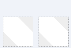
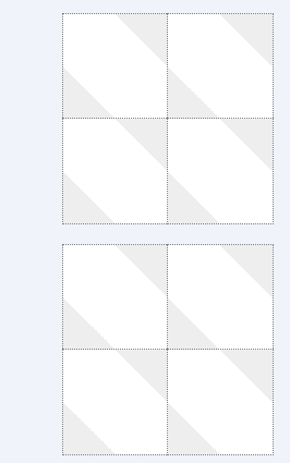
透明方格
HTML 代码:
<div class="square"></div>
CSS 代码:
.square {
    display: inline-block;
    padding: 300px;
    background-color: #fff;
    background-image: linear-gradient(45deg, #eee 25%, transparent 25%, transparent 75%, #eee 75%), linear-gradient(45deg, #eee 25%, transparent 25%, transparent 75%, #eee 75%);
    background-size: 16px 16px;
    background-position: 0 0, 8px 8px;
}
原理
1.下面两个图形错位叠加后的效果。
2.下面是若干图形平铺状态下的叠加效果。
镂空-图像剪裁
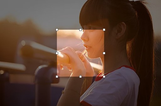
HTML 代码:
<div class="clip-img-x">
    <div class="clip-shape"></div>
    <img src="./mm.jpg" class="clip-img">
</div>
CSS 代码:
.clip-img-x {
    display: inline-block;
    overflow: hidden;
    position: relative;
}
.clip-img {
    display: block;
}
.clip-shape {
    width: 150px; height: 150px;
    outline: 9999px solid rgba(0,0,0,.5);
    position: absolute;
    left: 0; right: 0; top: 0; bottom: 0;
    margin: auto;
    cursor: move;
}
实现的关键就是使用巨大尺寸的 outline 模拟镂空。看下面的新手指导
新手指导
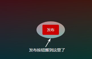
HTML 代码:
<div class="guide-x">
    <div class="guide-overlay">
        <i class="guide-overlay-shape" data-content="发布按钮搬到这里了"></i>
    </div>
    <button class="button">发布</button>
</div>
CSS 代码:
.guide-x {
    text-align: center;
    padding: 100px 16px;
    background-color: #fff;
    position: relative;
    overflow: hidden;
}
.guide-overlay {
    position: absolute;
    left: 0; top: 0; right: 0; bottom: 0;
    background: linear-gradient(transparent, transparent);
}
.guide-overlay-shape {
    width: 100px; height: 60px;
    position: absolute;
    left: 0; top: 0; right: 0; bottom: 0;
    margin: auto;
    border-radius: 50%;
    box-shadow: 0 0 0 9999px rgba(0,0,0,.75);
}
实现的关键就是使用巨大尺寸的 box-shadow 扩展模拟镂空。
也可以使用径向渐变实现,但没有 box-shadow 好理解好上手。
外圆角选项卡
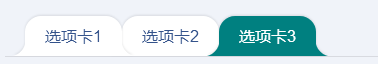
HTML 代码:
<div class="tab-x">
    <a href="javascript:" class="tab-a">选项卡 3</a>
    <a href="javascript:" class="tab-a">选项卡 2</a>
    <a href="javascript:" class="tab-a active">选项卡 1</a>
</div>
CSS 代码:
.tab-x {
    display: flex;
    flex-direction: row-reverse;
    justify-content: flex-end;
    padding-left: 20px;
    border-bottom: 1px solid rgba(0,0,0,.1);
}
.tab-a {
    --backgroundColor: #fff;
    background-color: var(--backgroundColor);
    line-height: 20px;
    padding: 10px 20px;
    border-radius: 16px 16px 0 0;
    filter: drop-shadow(0 -1px 1px rgba(0,0,0,.1));
    position: relative;
}
/* 创建外侧圆弧 */
.tab-a::before,
.tab-a::after {
    content: '';
    position: absolute;
    bottom: 0;
    width: 16px; height: 16px;
}
.tab-a::before {
    background: radial-gradient(circle at 0 0, transparent, transparent 16px, var(--backgroundColor) 17px);
    right: 100%;
}
.tab-a::after {
    background: radial-gradient(circle at 100% 0, transparent, transparent 16px, var(--backgroundColor) 17px);
    left: 100%;
}
.tab-a.active {
    --backgroundColor: teal;
    color: #fff;
    z-index: 1;
}
这里外部的圆角使用径向渐变实现。我们也可以使用 box-shadow 实现类似的效果,如下:

代码如下:
HTML 代码:
<div class="quar-radius"></div>
CSS 代码:
.quar-radius {
    width: 96px; height: 96px;
    border-radius: 0 0 50% 0;
    clip-path: polygon(0 0, 100% 0, 100% 100%, 0 100%);
    box-shadow: 0 0 0 100px teal;
}
任意图形镂空
黑色黑色半透明遮罩,中间镂空的是不规则图形,例如五角星:
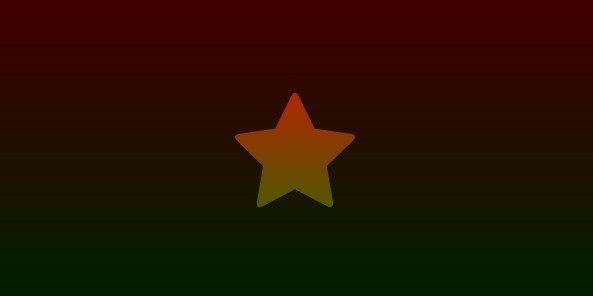
HTML 代码:
<div class="shape-hollow-x">
    <i class="shape-hollow"></i>
</div>
CSS 代码:
.shape-hollow-x {
    width: 600px;
    max-width: 100%;
    height: 300px;
    background: linear-gradient(red, green);
    position: relative;
}
.shape-hollow {
    position: absolute;
    left: 0; right: 0; top: 0; bottom: 0;
    margin: auto;
    background-color: rgba(0,0,0,.75);
    /* 实际开发需要-webkit- */
    mask: no-repeat center;
    mask-image: linear-gradient(black, black), url(./star.svg);
    mask-size: cover, 120px 120px;
    mask-composite: exclude;
    mask-composite: source-out;
}
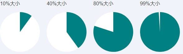
饼图图形与动画
1. 静态效果
HTML 代码:
<div class="pie-item">
    <p>10%大小</p>
    <div class="pie-simple" style="--percent: 10;">
        <div class="pie-left"></div>
        <div class="pie-right"></div>
    </div>
</div>
<div class="pie-item">
    <p>40%大小</p>
    <div class="pie-simple" style="--percent: 40;">
        <div class="pie-left"></div>
        <div class="pie-right"></div>
    </div>
</div>
<div class="pie-item">
    <p>80%大小</p>
    <div class="pie-simple" style="--percent: 80;">
        <div class="pie-left"></div>
        <div class="pie-right"></div>
    </div>
</div>
<div class="pie-item">
    <p>99%大小</p>
    <div class="pie-simple" style="--percent: 99;">
        <div class="pie-left"></div>
        <div class="pie-right"></div>
    </div>
</div>
CSS 代码:
.pie-simple {
    width: 128px; height: 128px;
    background-color: white;
    border-radius: 50%;
    overflow: hidden;
}
.pie-left,
.pie-right {
    width: 50%; height: 100%;
    float: left;
    position: relative;
    overflow: hidden;
}
.pie-left::before,
.pie-right::before,
.pie-right::after {
    content: '';
    position: absolute;
    width: 100%; height: 100%;
    background-color: teal;
}
.pie-left::before {
    left: 100%;
    transform-origin: left;
    transform: rotate(calc(3.6deg * (var(--percent) - 50)));
    opacity: calc(99999 * (var(--percent) - 50));
}
.pie-right::before {
    right: 100%;
    transform-origin: right;
    transform: rotate(calc(3.6deg * var(--percent)));
}
.pie-right::after {
    opacity: calc(99999 * (var(--percent) - 50));
}
2. 动画效果(单循环-左,交替循环-右)
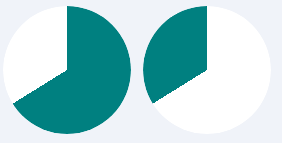
HTML 代码(交替循环):
<div class="pie-spin2">
    <div class="pie-spin2-left"></div>
    <div class="pie-spin2-right"></div>
</div>
CSS 代码(交替循环):
.pie-spin2 {
    width: 128px; height: 128px;
    background-color: white;
    border-radius: 50%;
    overflow: hidden;
}
.pie-spin2-left,
.pie-spin2-right {
    width: 50%; height: 100%;
    float: left;
    position: relative;
    overflow: hidden;
}
.pie-spin2-left::before,
.pie-spin2-right::before {
    content: '';
    position: absolute;
    width: 100%; height: 100%;
    background-color: teal;
}
.pie-spin2-left::before {
    left: 100%;
    transform-origin: left;
    animation: spinWait2 3.2s infinite linear;
}
.pie-spin2-right::before {
    right: 100%;
    transform-origin: right;
    animation: spinWait1 3.2s infinite linear;
}
@keyframes spinWait1 {
    0%        { transform: rotate(0deg); }
    25%, 50%  { transform: rotate(180deg); }
    75%, 100% { transform: rotate(360deg); }
}
@keyframes spinWait2 {
    0%, 25%  { transform: rotate(0deg); }
    50%, 75% { transform: rotate(180deg); }
    100%     { transform: rotate(360deg); }
}
HTML 代码(单循环):
<div class="pie-spin">
    <div class="pie-spin-left"></div>
    <div class="pie-spin-right"></div>
</div>
CSS 代码(单循环):
.pie-spin {
    width: 128px; height: 128px;
    background-color: white;
    border-radius: 50%;
    overflow: hidden;
}
.pie-spin-left,
.pie-spin-right {
    width: 50%; height: 100%;
    float: left;
    position: relative;
    overflow: hidden;
}
.pie-spin-left::before,
.pie-spin-right::before,
.pie-spin-left::after,
.pie-spin-right::after {
    content: '';
    position: absolute;
    width: 100%; height: 100%;
    background-color: teal;
}
.pie-spin-left {
    opacity: 1;
    animation: second-half-show 1.6s steps(1, end) infinite;
}
.pie-spin-left::before {
    left: 100%;
    transform-origin: left;
    animation: spin 1.6s .8s infinite linear;
}
.pie-spin-right::before {
    right: 100%;
    transform-origin: right;
    animation: spin 1.6s infinite linear;
}
.pie-spin-right::after {
    animation: second-half-show 1.6s steps(1, end) infinite;
    opacity: 1;
}
.pie-spin-left::after {
    animation: second-half-hide 1.6s steps(1, end) infinite;
    opacity: 0;
}
@keyframes spin {
  0%   { transform: rotate(0); }
  100% { transform: rotate(360deg); }
}
@keyframes second-half-hide {
  0%        { opacity: 1; }
  50%, 100% { opacity: 0; }
}
@keyframes second-half-show {
  0%        { opacity: 0; }
  50%, 100% { opacity: 1; }
}
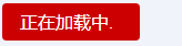
文本打点 loading 动画
最佳实现方式
HTML 代码:
正在加载中<dot-a>...</dot-a>
CSS 代码:
dot-a {
    display: inline-block;
    height: 1em; line-height: 1;
    text-align: left;
    vertical-align: -.25ex;
    overflow: hidden;
}
dot-a::before {
    display: block;
    content: '...\A..\A.';
    white-space: pre-wrap;
    animation: dot1 3s infinite step-start both;
}
@keyframes dot1 {
    33% { transform: translateY(-2em); }
    66% { transform: translateY(-1em); }
}
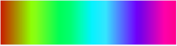
视觉错觉与流动动画
色彩的流动
看上去在流动:
HTML 代码:
<div class="flow-colorful"></div>
CSS 代码:
.flow-colorful {
    max-width: 600px;
    height: 150px;
    background: linear-gradient(to right, red, orange, yellow, green, cyan, blue, purple);
    animation: hue 6s linear infinite;
}
@keyframes hue {
    from {
        filter: hue-rotate(0deg);
    }
    to {
        filter: hue-rotate(360deg);
    }
}
文字动效
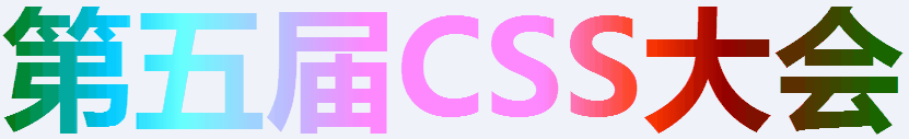
HTML 代码:
<h2 class="flow-slogon">第五届 CSS 大会</h2>
CSS 代码:
.flow-slogon {
    font-size: 120px;
    -webkit-background-clip: text;
    -webkit-text-fill-color: transparent;
    background-image: linear-gradient(to right, red, yellow, lime, aqua, blue, fuchsia);
    animation: hue 6s linear infinite;
}
移动的错觉
斜纹进度条:
视觉上是前进,实际上是上下移动。
HTML 代码:
<div class="flow-twill"></div>
CSS 代码:
.flow-twill {
    padding-right: 30%;
    height: calc(1.4142 * 20px);
    background: repeating-linear-gradient(45deg, teal, teal 10px, transparent 11px, transparent 19px, teal 20px);
    background-clip: content-box;
    animation: twill 1s linear infinite;
    position: relative;
}
.flow-twill::before {
    content: '';
    position: absolute;
    width: 100%; height: 100%;
    background: linear-gradient(rgba(0,0,0,.5), hsla(0,0%,100%,.5), rgba(0,0,0,.5));
}
@keyframes twill {
    from {
        background-position: 0 0;
    }
    to {
        background-position: 0 calc(-1 * 1.4142 * 40px);
    }
}
移动与水波的错觉
CSS 模拟的波浪线
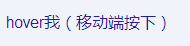
HTML 代码:
<a href="javascript:" class="flow-wave">hover 我(移动端按下)</a>
CSS 代码:
.flow-wave {
    padding: 5px 0;
}
.flow-wave:hover,
.flow-wave:focus {
    background: radial-gradient(circle at 10px -7px, transparent 8px, currentColor 8px, currentColor 9px, transparent 9px) repeat-x,
        radial-gradient(circle at 10px 27px, transparent 8px, currentColor 8px, currentColor 9px, transparent 9px) repeat-x;
    background-size: 20px 20px;
    background-position: -10px calc(100% + 16px), 0 calc(100% - 4px);
    animation: waveFlow 1s infinite linear;
}
@keyframes waveFlow {
    from { background-position-x: -10px, 0; }
    to { background-position-x: -30px, -20px; }
}
纯 CSS 实现分栏宽度拉伸调整
效果(PC only,Android 亦可)
拖拽分隔线,可以改变左右两栏尺寸。
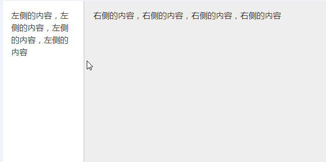
HTML 代码:
<div class="column">
    <div class="column-left">
        <div class="resize-bar"></div>
        <div class="resize-line"></div>
        <div class="resize-save">
            左侧的内容,左侧的内容,左侧的内容,左侧的内容
        </div>
    </div>
    <div class="column-right">
        右侧的内容,右侧的内容,右侧的内容,右侧的内容
    </div>
</div>
CSS 代码:
.column {
    overflow: hidden;
}
.column-left {
    height: 400px;
    background-color: #fff;
    position: relative;
    float: left;
}
.column-right {
    height: 400px;
    padding: 16px;
    background-color: #eee;
    box-sizing: border-box;
    overflow: hidden;
}
.resize-save {
    position: absolute;
    top: 0; right: 5px; bottom: 0; left: 0;
    padding: 16px;
    overflow-x: hidden;
}
.resize-bar {
    width: 200px; height: inherit;
    resize: horizontal;
    cursor: ew-resize;
    opacity: 0;
    overflow: scroll;
}
/* 拖拽线 */
.resize-line {
    position: absolute;
    right: 0; top: 0; bottom: 0;
    border-right: 2px solid #eee;
    border-left: 1px solid #bbb;
    pointer-events: none;
}
.resize-bar:hover ~ .resize-line,
.resize-bar:active ~ .resize-line {
    border-left: 1px dashed skyblue;
}
.resize-bar::-webkit-scrollbar {
    width: 200px; height: inherit;
}

/* Firefox 只有下面一小块区域可以拉伸 */
@supports (-moz-user-select: none) {
    .resize-bar:hover ~ .resize-line,
    .resize-bar:active ~ .resize-line {
        border-left: 1px solid #bbb;
    }
    .resize-bar:hover ~ .resize-line::after,
    .resize-bar:active ~ .resize-line::after {
        content: '';
        position: absolute;
        width: 16px; height: 16px;
        bottom: 0; right: -8px;
        background: url(./resize.svg);
        background-size: 100% 100%;
    }
}
原理
利用浏览器非 overflow:auto 元素设置 resize 可以拉伸的特性实现无 JavaScript 的分栏宽度控制。
webkit 浏览器下滚动条可以自定义,其中 resize 区域大小就是 scrollbar 的大小,于是,我们可以将整个拉伸区域变成和容器一样高。
结束语
以上就是今天码云笔记为大家带来的全部关于分享纯 CSS 创意与视觉表现的代码篇,当然之前也有很多比较好的效果大家可以看这篇文章《css 优雅的画出形状图形》。
 微信
微信 支付宝
支付宝码云笔记 » 分享纯CSS创意与视觉表现的代码收藏


好文,感谢楼主分享的纯CSS创意与视觉表现的代码,收藏一下以后用